Hi! This is the ZapPost brand guide: how the brand looks, how it speaks and where Zapinho shows up. Need the logo or Zapinho? Download the files.
Shortcuts
identity
Logo, colors and type. What makes something look like ZapPost before anyone reads a word.
View guide
voice
How ZapPost writes: direct, in second person, no jargon and no AI-sounding text.
View guidezapinho
The house mascot. Who he is, his six versions and where he belongs (and where he doesn't).
View guide
posts
Carousels, posts and stories in ZapPost's own kit: dark slide, light slide and what each color is for.
View guidefiles
Logo, Zapinho and fonts to download, in the right version for each use.
View filesidentity
The right logo in the right place, the blue in the right shade for each background and the type at the right weight. That is what makes something look like ZapPost before anyone reads a word.
Logo
There are two sets of files and they are not interchangeable. The website uses the logo without the mascot. Social media and brand material use the logo with Zapinho.
On the website


logo-zappost-preta.webp on light backgrounds, logo-zappost-branca.webp on dark ones. 38px tall in the header, 32px in the footer.
On social media and brand material

logo-horizontal.png and logo-quadrada.png. They carry Zapinho and are for posts, stories, decks and ads.
Colors
The website has a light theme and a dark theme, following the person's system setting. Every color rule considers both. Click a color to copy its code.
Primary blue
There are two blues because each one was calibrated for its background. #3B7BF0 on white drops to a 2.7 contrast ratio and disappears.
Dark theme
Light theme
Typography
New material (posts, carousels, stories, brand pieces) uses Manrope: 700 for headings, 400 for body text. For handwritten-style notes, Caveat 700.
Manrope 700 · 400 · Caveat 700
Tired of opening Canva and closing it without posting anything?
You open the Studio, pick a carousel, a post or a Reels script, say the topic and download it ready to post. No hours in Canva.
post today, tweak tomorrow
The website uses a different pair. Pages on zappost.ai use Clash Display for headings (600 and 700) and Satoshi for body text (400, 500 and 700). Inter left production with the redesign. A highlight inside a heading is made with weight and color, within the same family.
Highlights in headings
When part of a heading gets the blue, only the words get it. The period, question mark and comma stay in the color of the surrounding text, and in the code they sit outside the <em>.
Tomorrow's post is already done.
Tomorrow's post is already <em>done</em>.
Tomorrow's post is already done.
Tomorrow's post is already <em>done.</em>
voice
Direct and relaxed, without being too casual. We speak like someone who understands the customer's problem, in short sentences, everyday words and no jargon.
Tone
We talk like a friend who solves the problem, not like a startup selling AI.
The person on the other side opens Instagram during lunch, sees they haven't posted anything this week and closes the app feeling guilty. That is who we talk to. We talk about what they get (the post ready, the time back) and almost never about the technology behind it.
What we use
- You, always. Second person in everything.
- Concrete language. "A notification on your phone and the post is ready to download", "no hours in Canva".
- The problem before the pitch. "Tired of opening Canva and closing it without posting anything?"
- Plain verbs and short sentences. If "it didn't work" says it, we don't write "it presented unexpected behavior".
What we avoid
- Marketing and tech jargon: "innovative solution", "revolutionize", "disruptive".
- AI hype and vague promises. We talk about the practical result.
- Corporate formality: "Dear customer", "come and discover our platform".
- Guaranteed results. Results vary by niche and by consistency, and we say so.
- Em dashes in any public text. They become a period, a comma or a separate sentence.
- Counting how many pages the site has inside the copy. The number changes and nobody comes back to fix it.
AI tells
None of this goes out, and it is not a ZapPost preference: it applies to every published text, ours and every customer's.
| What | Instead |
|---|---|
| Em dash (—) and en dash (–) | Comma, period, colon or parentheses. |
| Binary structure | "It's not X, it's Y", "less X, more Y", "no X, no Y": just say what it is. The negation up front adds nothing. |
| Writing crutches | "It's worth noting", "it's important to remember", "in summary", "that said": delete. The sentence works without them. |
| AI tics | "Here's the thing", "and that changes everything", "at the end of the day": go straight to what comes after. |
| Ad superlatives | "Revolutionary", "incredible", "powerful", "game-changing": describe what the thing does. |
| Clickbait calls | "Dive in", "unlock the secret", "you won't believe": say the subject directly. |
| Intro filler | "In today's world", "now more than ever": start with the information. |
| Internal names for the work | "Piece", "creative", "copy", "asset": the name the customer uses. Post, carousel, caption, story, Reels. |
| A sentence that fits any business | If it fits a nutritionist, a dentist and a lawyer without changing a word, the reader notices it wasn't written for them. Use the term the field uses. If you don't know it, don't write the sentence. |
How Zapinho talks
Inside the app and on social media, the mascot has a voice of his own: upbeat, playful, celebrates small wins and is never mean.
Slang and contractions are fine here: it is the character talking, not the website.
zapinho
A laid-back, upbeat friend who is always ready to help. He believes every small business owner can grow on Instagram, they just need a little push (and good posts, of course).
Who he is
- Overly optimistic. Sees an opportunity in everything, like that coworker who is always motivated.
- Laid-back. Talks like a friend, not like a brand.
- Genuinely interested. Wants to know how the customer's business is going, and isn't just selling.
- Celebrates small wins. Every new follower and every sale is a reason to party.
- No positive filter. Jokes around, sometimes ironic, never mean.
The six versions
All share the same base: blue body, dark outline, the speech bubble and the bolt. What changes is the accessory and the expression, depending on the context.





Where he belongs
- In-app notifications, celebrating what the person did.
- Ads and email. Marketing outside the website.
- Posts, stories and Reels, always in one of the versions above.
- Onboarding: welcome, guides, tutorials.
- Error and success messages, to keep them human.
Where he doesn't
On zappost.ai pages. Home, pricing, tools, blog, help: none of them. The website has a grown-up register and uses the logo without the mascot. If he appears, it is once, in some corner of the page.
- Don't stretch, distort or remove parts (the bubble and the bolt are part of him).
- Don't change the body color. A contrast adjustment is the only exception.
- Don't use him in negative or aggressive contexts.
- Don't place him on a background that makes the face hard to read.
Sizes and color
- 128px tall, minimum, in interfaces. 256px in marketing material.
- 8px of clear space on every side, minimum.
- Body in the brand blue:
#3B7BF0on dark backgrounds,#1E5FE3on light ones. Outline#1a2e5c. - Accessories can have other colors (green hat, golden dollar sign). Zapinho himself is always blue.
Not yet available: SVG version, Lottie animation and a dark-theme adjustment (the sunglasses vanish on dark backgrounds).
posts
The zappost-marca kit is the one for ZapPost's own profile. It is for @zappost.brasil and is not offered to any customer, because it is the house brand and not a palette chosen for an audience.
The two slides
The alternate slide inverts the theme instead of getting a little darker. First the alternate was the website's card color #1e2330 (a 4% difference, invisible on phones), then #262c3d (1.29 contrast, still subtle). Both attempts made the same mistake: changing only the background and keeping the light ink. Now the light slide brings the whole pair, background and ink, and the contrast from one slide to the next is 16.4.
12px corner radius. Manrope 700 for headings, 400 for text. Caveat 700 for handwritten notes.
The kit colors
| Name in the kit | Value | What for |
|---|---|---|
| fundo | #14171f | Dark slide background. |
| fundo-alt | #1e2330 | Second shade of the same theme. Both sides of the chat in the dialogue layout, the alternation in the explainer and the before-and-after. |
| tinta | #eef0f5 | Main text on dark. |
| tinta-suave | #8a8f9e | Supporting text on dark (5.55 contrast over the flat background). |
| destaque | #3B7BF0 | Blue of the dark slide. |
| tinta-destaque | #ffffff | Text over the blue. |
| fundo-inverso | #F4F5F8 | Light slide background. |
| tinta-inversa | #14171f | Main text on light. |
| tinta-suave-inversa | #5a6072 | Supporting text on light. |
| destaque-inverso | #1E5FE3 | Blue of the light slide. #3B7BF0 on white drops to 2.7. |
| tinta-suave-foto | #c3c8d4 | Supporting text over a slide with a photo. |
Alternate and inverse
They are two different things.
- fundo-alt is the second shade of the same theme, next to the background. The dialogue layout uses it on both sides of the chat; the explainer, the annotated photo, the dated story, the before-and-after, the offer card and the modern creative use it to alternate.
- fundo-inverso is the opposite theme, with background and ink swapped together.
When the inverse took over the name fundo-alt, the dialogue came out with a white bubble and white text, and a whole white slide with an invisible signature. Nobody had touched the dialogue.
Over photos
The normal supporting gray (#8a8f9e) was calibrated against the flat background. With an image underneath it drops to 2.51 on the light parts and disappears. On a slide with a photo, supporting text uses tinta-suave-foto (#c3c8d4), which holds 4.83 on the worst patch.
Website and social
Logo without the mascot. Automatic light and dark theme. Inter, under review. Zapinho at most once, in some corner.
Logo with Zapinho. Manrope and Caveat. The kit above, dark slide and light slide alternating. Zapinho speaks in his own voice.
The product
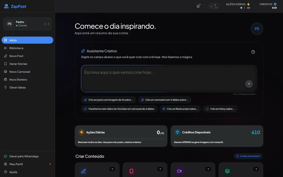
Where the customer lives: studio.zappost.ai, in the dark theme. Screenshot for reference on tone and color.
files
The logo, Zapinho and the fonts, ready to download. Use the right version for each place: no mascot on anything about the product, Zapinho on social media.
Logos
PNG for the logo with Zapinho, WebP for the website logo.
| Horizontal with Zapinho | logo-horizontal.png (1365 × 768) |
| Square with Zapinho | logo-quadrada.png (1080 × 1080) |
| Website, light background | logo-zappost-preta.webp |
| Website, dark background | logo-zappost-branca.webp |

Zapinho
The six versions, as 1024 × 1024 PNGs with a white background.
| Party | zapinho-comemorando.png |
| Awe | zapinho-com-estrelas-nos-olhos.png |
| Money | zapinho-pensando-em-dinheiro.png |
| Love | zapinho-apaixonado.png |
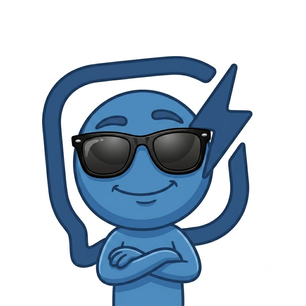
| Cool | zapinho-de-oculos.png |
| Cowboy | zapinho-cowboy.png |





Fonts
All four are free. The ones for posts are on Google Fonts; the website ones are on Fontshare.
| Manrope | fonts.google.com/specimen/Manrope. 700 for headings, 400 for text. |
| Caveat | fonts.google.com/specimen/Caveat. 700, for handwritten-style notes. |
| Clash Display | fontshare.com/fonts/clash-display. 600 and 700, for website headings. |
| Satoshi | fontshare.com/fonts/satoshi. 400, 500 and 700, for website text. |
How to use
- Logo without the mascot on anything about the product: website, decks, documents.
- Logo with Zapinho on social media and in ads.
- Don't stretch, crop or recolor. On dark backgrounds, use the white version.
- Zapinho is at least 128px tall on screen, with 8px of clear space around him.
A use that isn't covered here? Talk to us.